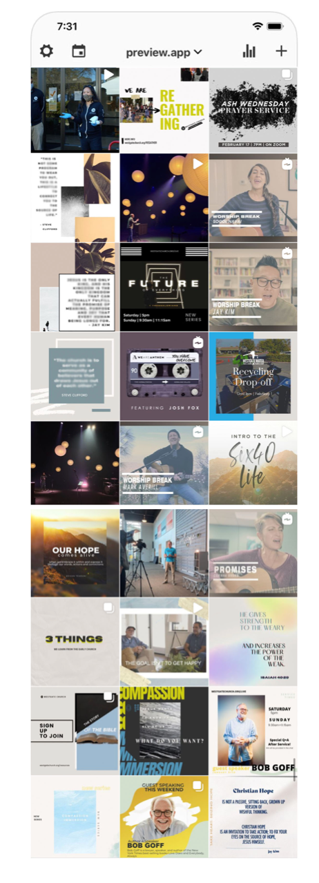
Here is a bigger context of how these colors were consistently used on the Instagram grid, while also integrating content themes with consistent design styles.
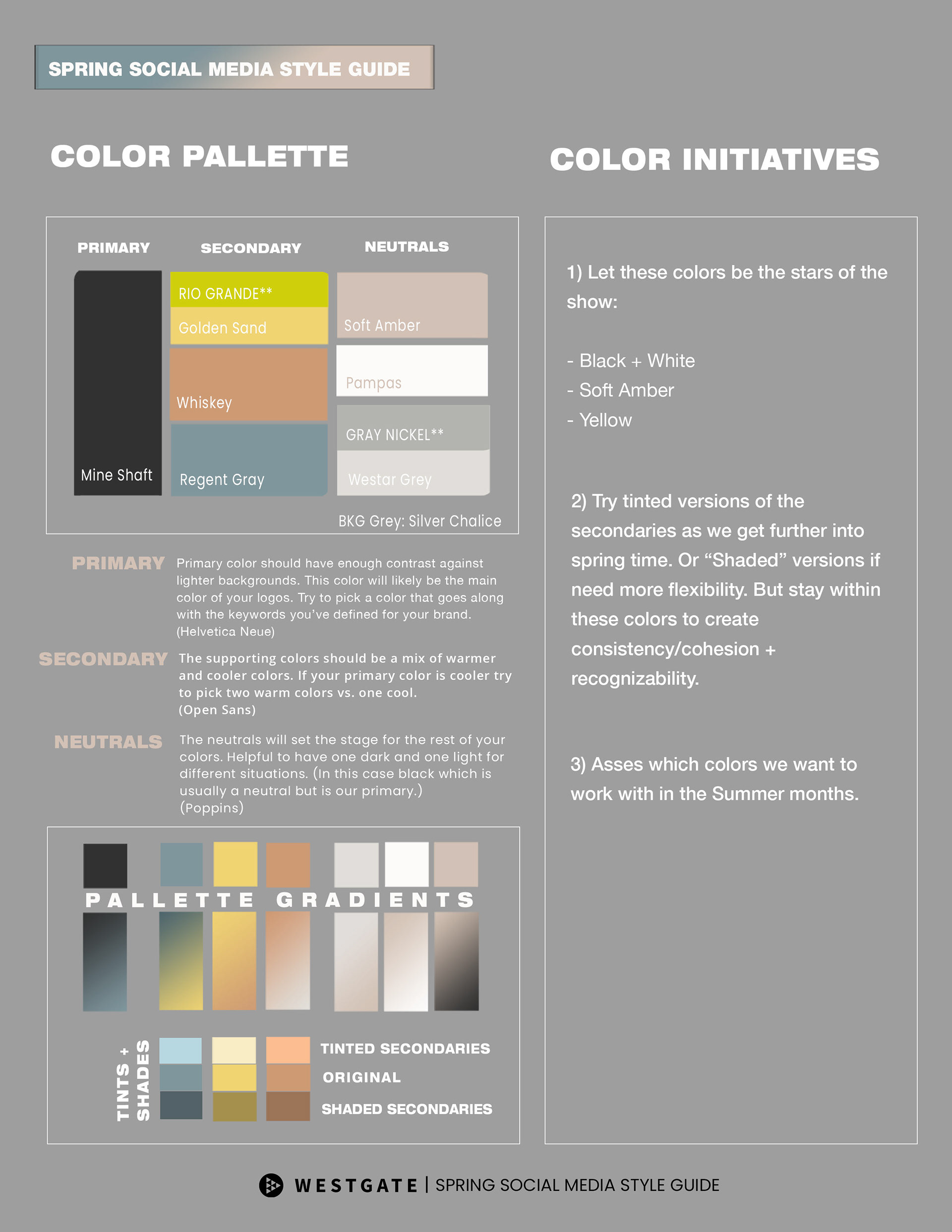
As for color principles, Soft Amber, Yellow, and Black were the staple colors I wanted to draw focus to as a primary, secondary and neutral selection.
I strategically used soft amber as an overlay for specific video thumbnails and for many graphic backgrounds. I used black liberally as the primary for typography. And I used splashes of yellow occasionally throughout designs.