For this project I worked with the company Founder, Susan Gibson.
The design process for their company logo:
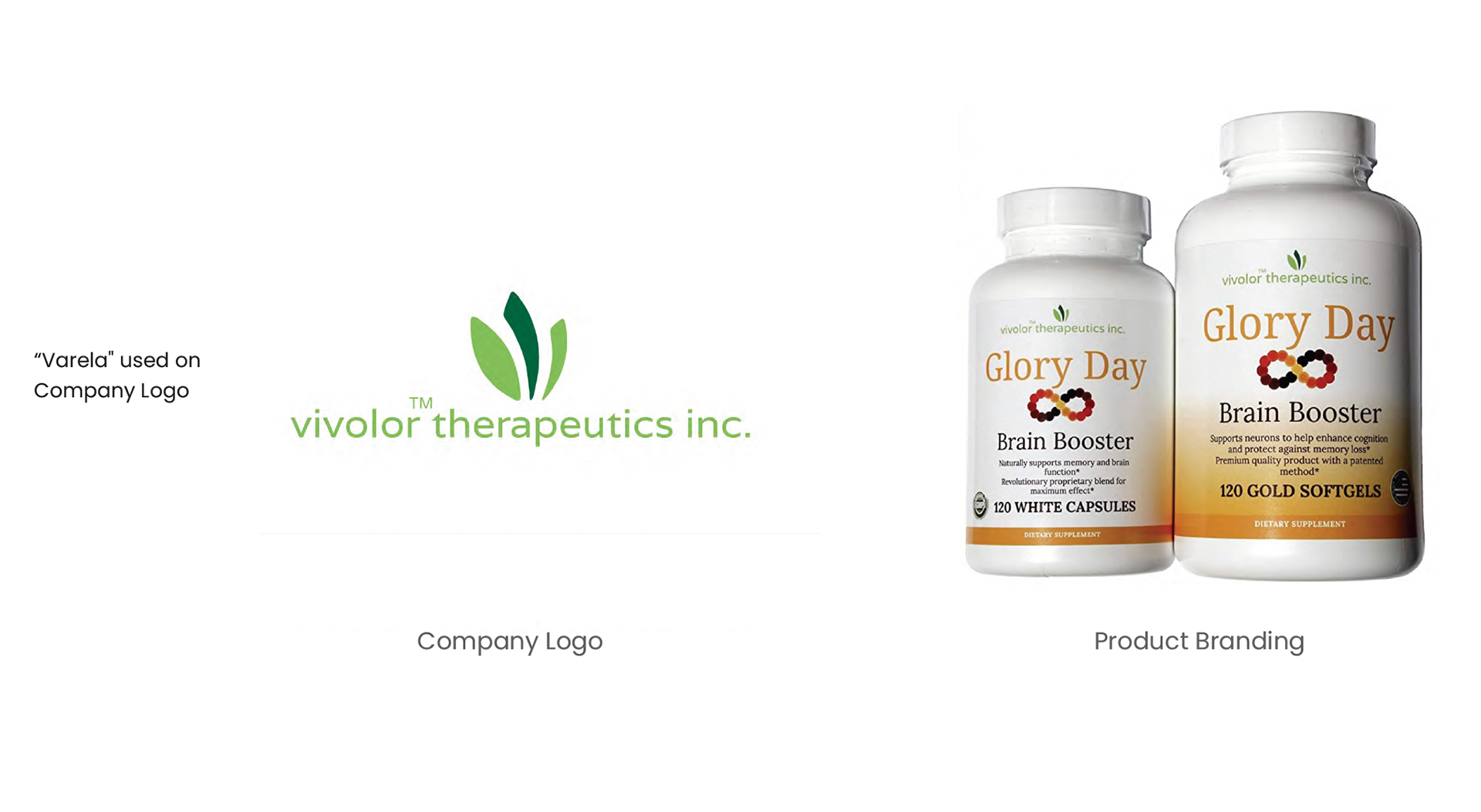
I took Susan through various branding iterations regarding style, color, typography and logo. This was a very collaborative process which I enjoyed walking her through. We eventually came to the final design of three leaves, two seperate shades of green with all lowercase san serif font. This felt like the right balance of highlighting the natural theme of the product (with the green tones) while also being seen as relevant, appealing and trendy (with the lowercase san serif).
The design process for their product logo:
After going through different iterations with Susan, I honed in on a vivid color pallete using yellow, orange, red and purple. These colors were used to evoke the sense of the product being productive and positive. I also created the logo using imagery of an infinity symbol because it represented the sense of the product aiming to reverse aging in the brain, hence the idea of being unaffected by age, or timelessness. Each small circle within the infinity symbol was meant to represent individual molecules, or give similarity to links in a chain, showing movement. The color change within the circles also aided in creating a sense of movement and depicting the product at work. For typography, it was decided to use a serif font, to lend the sense of stability and credibility to the product that traditionally comes with a serif font.